.png)
To understand how to improve communication between preschool staff and parents, we focused our research on the following questions:
How do parents currently receive updates about their child’s day?
What pain points exist in current communication methods?
What makes parents feel informed, connected, and emotionally supported?
How do different behaviour types (digital vs. communicative) affect their expectations?
We conducted in-depth interviews with seven parents and two staff to uncover everyday communication challenges in preschool settings. These insights became the foundation for defining user types and shaping the Kiddolink app’s core features.
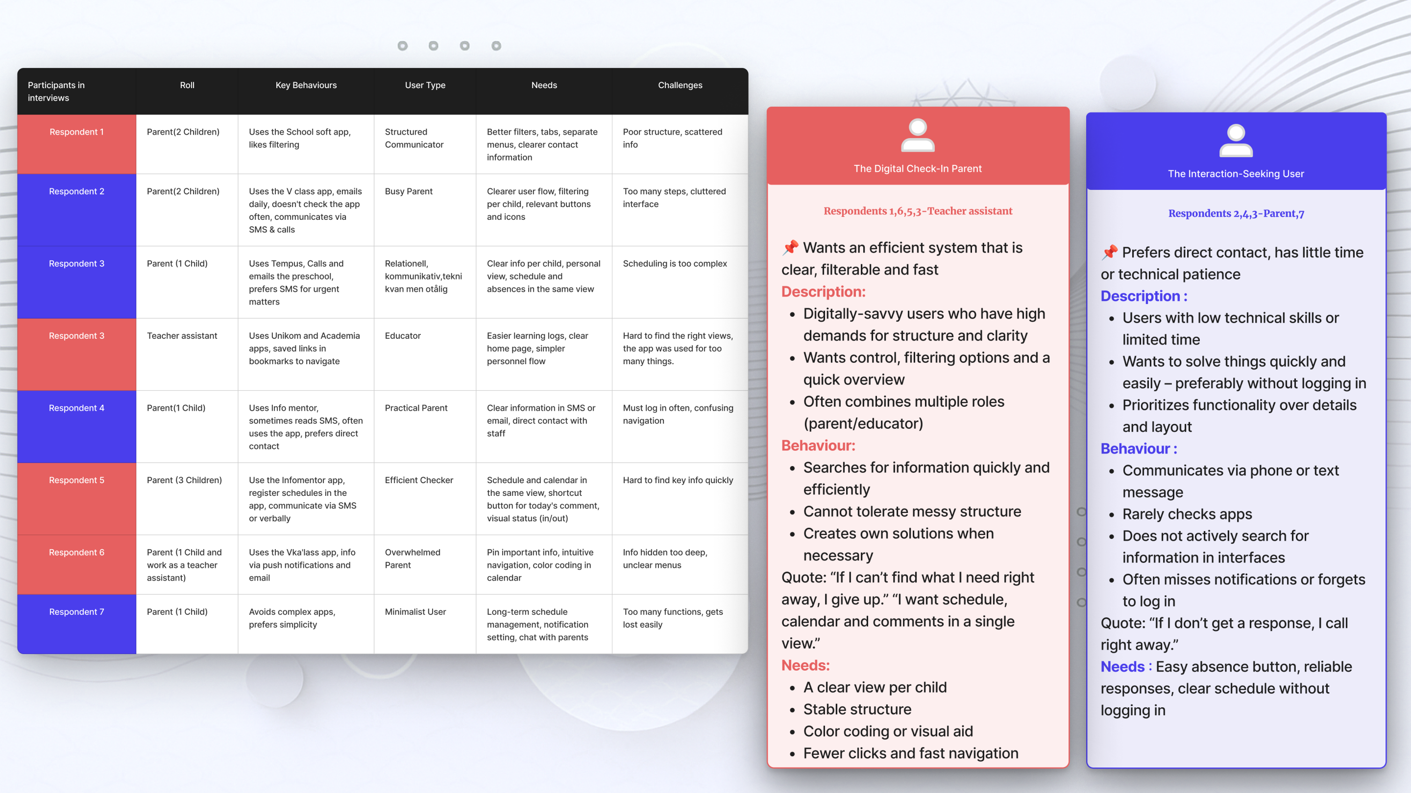
This overview table summarizes all our interview participants – their roles, motivations, behaviours, types, wishes and challenges. We used it to identify needs, categorize user types and shape our solution. It also highlights the variation in users’ technical skills, daily routines and preferences.
💬 Key Insights from the Interviews
🔄
→ A need for centralized and clear communication Users expressed frustration over scattered information.
A unified platform with clear structure was highly desired.
🧍♀
→ Different user behaviours require tailored solutionsNot all parents interact the same way — some prefer browsing information passively, while others need direct communication features.
😖
→ Poor interface design leads to frustration and reduces trust
Confusing layouts or missing feedback discouraged users and made them less likely to rely on the app.
.png)
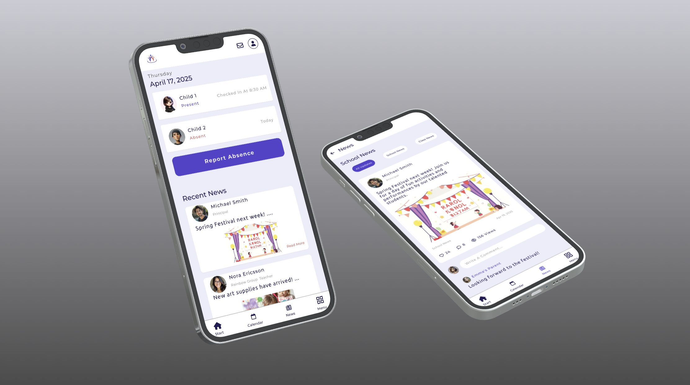
Each screen reflects a user-validated concept — designed based on user behaviour, voting, and real communication needs.
.png)
.png)
These screens reflect the final visual style, branding, and responsive layout of the Kiddolink MVP.
.png)
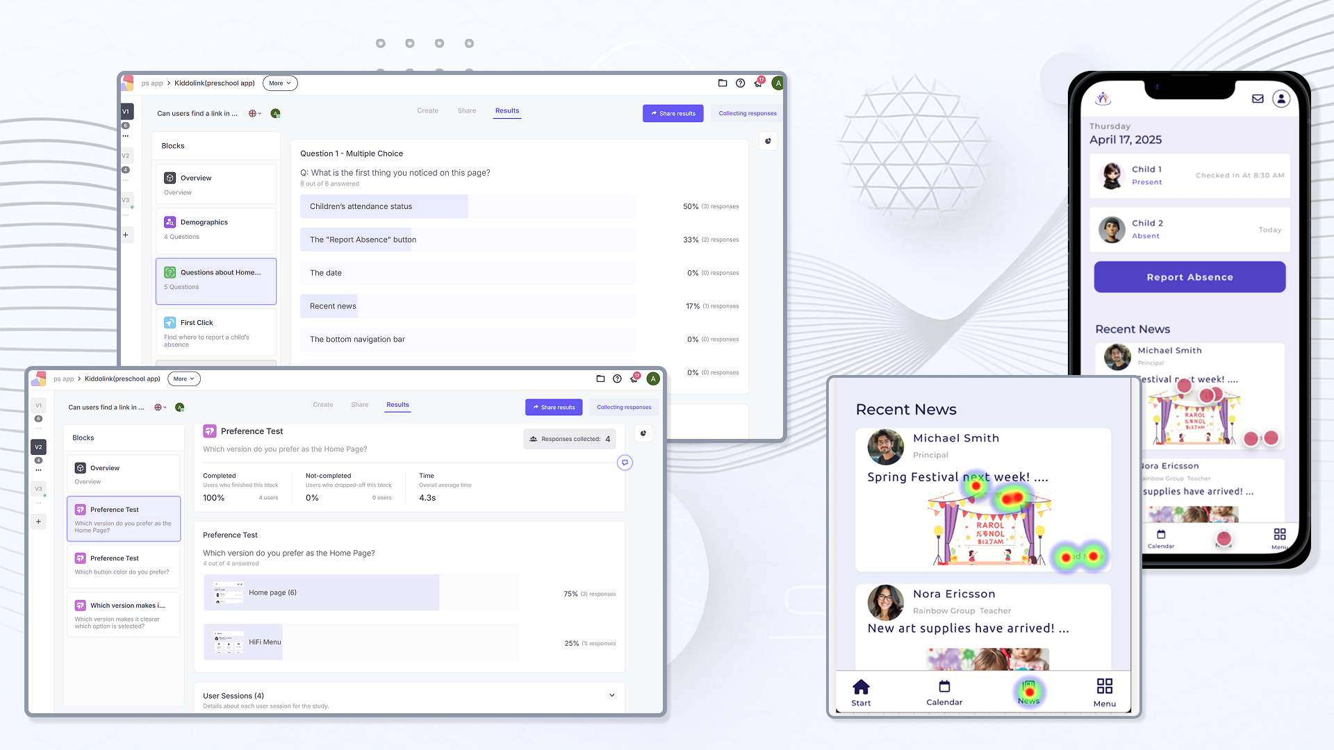
We tested the prototype with both behavioural user types — "digital check-in" and "communicative" — using in-person guerrilla testing and remote sessions via Useberry. Tasks included checking the daily plan, sending messages, and reporting absence. The feedback helped us validate key flows and uncover small UX issues.
Through observation and screen recording, we identified areas of friction in navigation, communication clarity, and flow logic. The feedback directly informed design iterations.
Here are the key changes we made after testing:
“Full Day” vs. “Custom” was unclear — so we clarified layout and labels
Child 1/2 buttons were replaced with checkboxes, which users understood instantly
Blue buttons improved accessibility and readability — so we kept them
The calendar was slightly adjusted to better align with the checkbox layout
Absent status is now marked in red to stand out during quick scans
News cards are now fully clickable (not just the text) — based on click data and heatmaps
By iterating quickly based on user feedback, we were able to improve clarity, accessibility, and the overall experience — a crucial step in our UX process.
.png)

.png)
To understand how to improve the online shopping experience for modern lighting and chandeliers, we focused our research on the following questions:
How do users currently search for lighting products online?
What frustrations do they face when comparing different options?
What factors (style, material, price, energy efficiency) are most important in their decision-making?
How do users want to visualize lighting products in their own environment?
What role does aesthetics vs. functionality play in their shopping behavior?
We conducted user interviews with interior designers and homeowners to uncover challenges in buying modern lighting online. These insights became the foundation for defining user needs and shaping Luminova’s core features. This overview summarizes participants’ roles, motivations, preferences, and frustrations. We used it to identify pain points, prioritize user needs, and guide the design of filtering, comparison, and showroom solutions.
💬 Key Insights from the Interviews
🔎
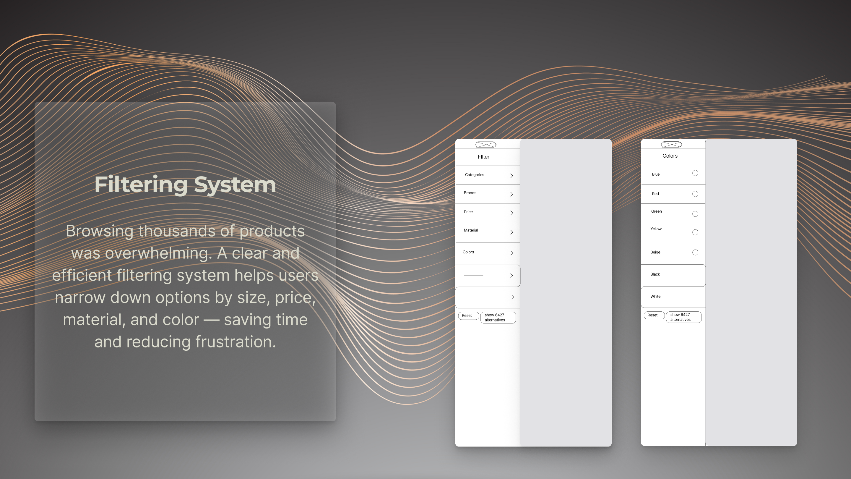
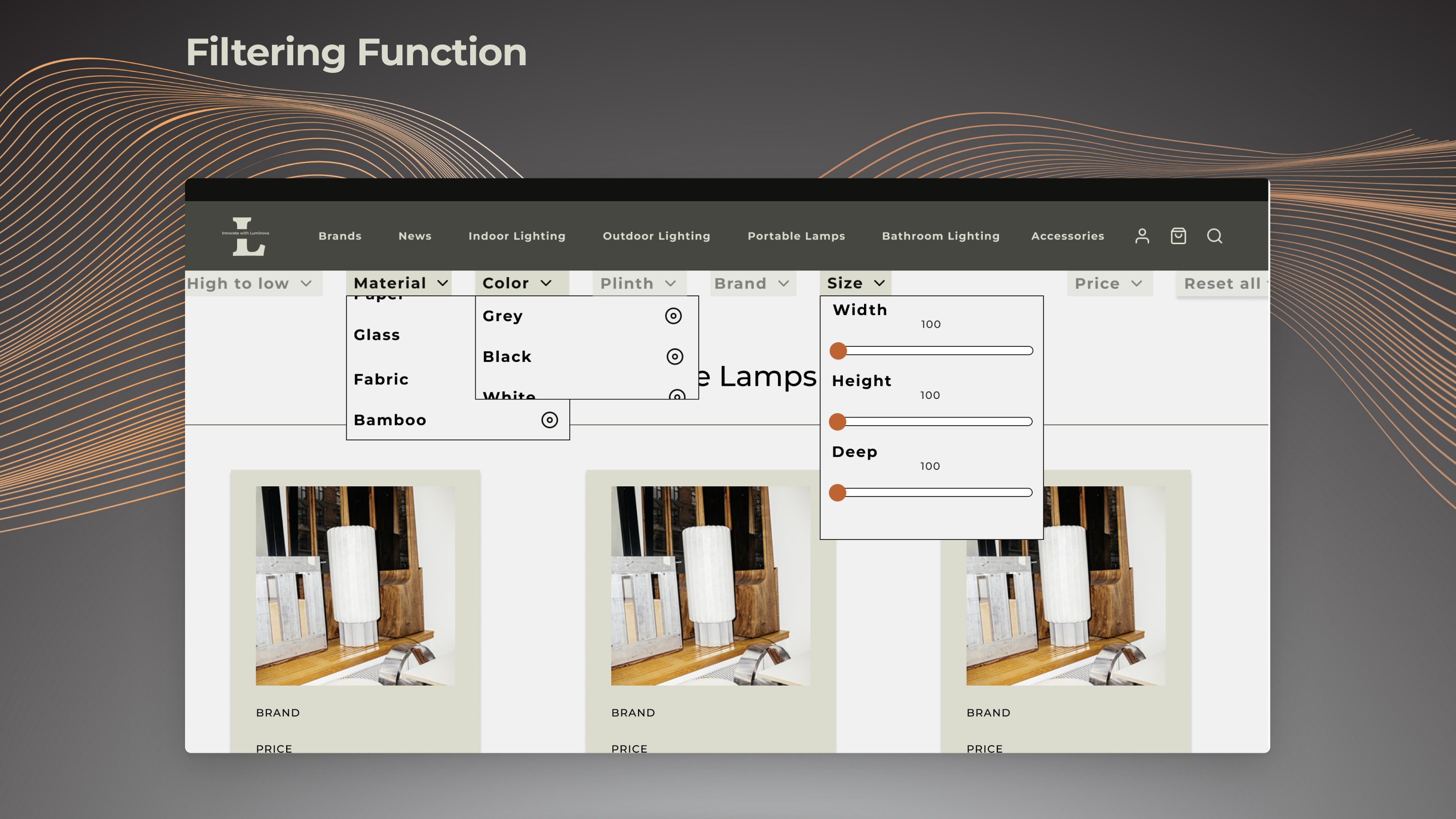
→ A need for better product discoveryUsers expressed frustration with scattered filters and unclear navigation on existing platforms.
A clear filtering system for size, material, and price was highly desired.
⚖️ → Difficulty comparing similar productsParticipants reported they had to open multiple tabs to compare items, which was time-consuming and confusing.
A side-by-side comparison tool was requested.
🎨
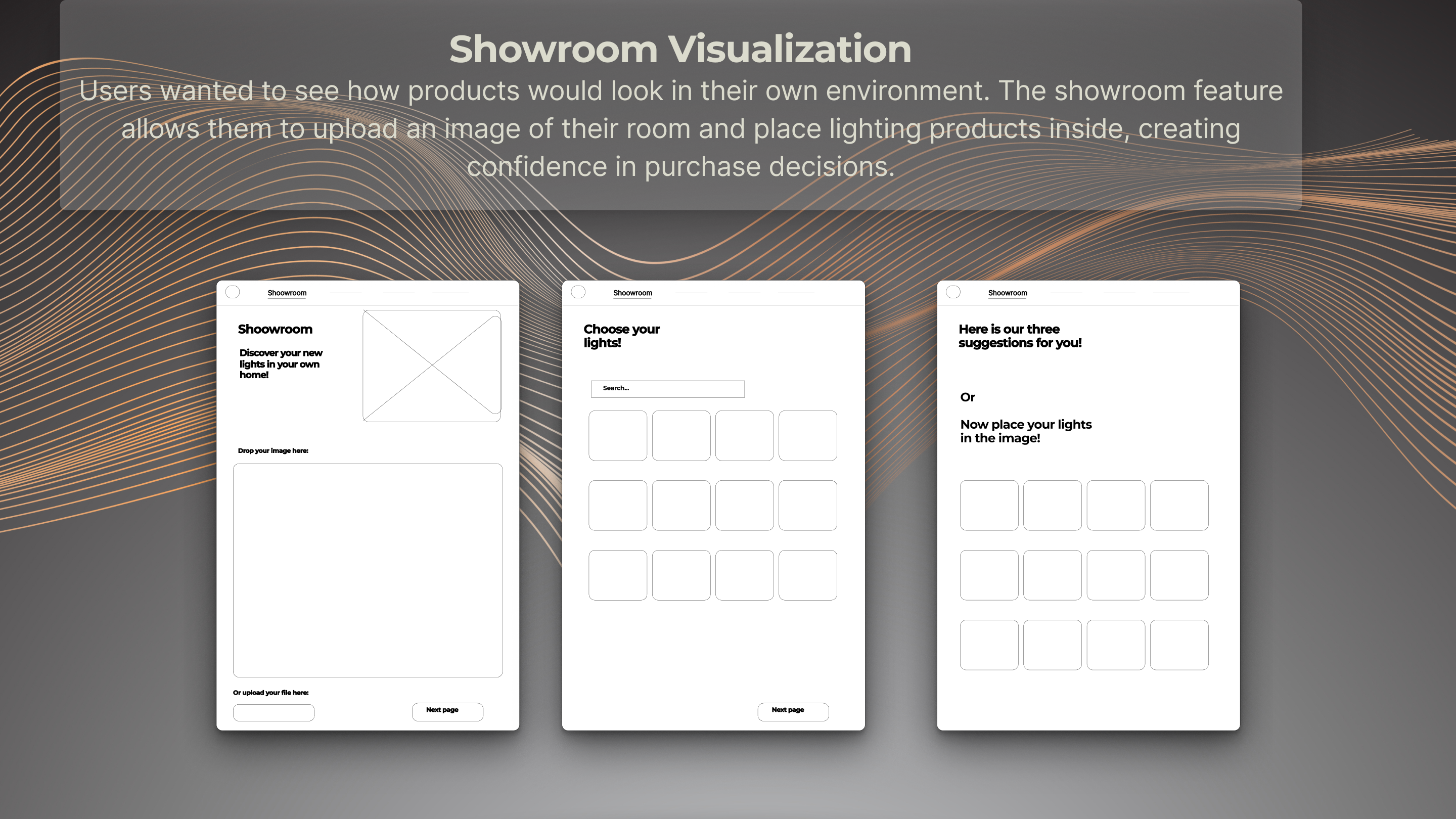
→ Visualization is essential
Interior designers emphasized the importance of seeing how products fit into a specific room or style.
Lack of visualization tools led to uncertainty in purchase decisions.
⏳
→ Time efficiency matters
Both designers and homeowners wanted to save time by accessing curated product suggestions and quick comparisons instead of browsing endlessly.
.png)
We translated user needs into concrete design solutions. The following wireframes illustrate how we approached filtering, comparison, and visualization features to simplify the shopping experience for modern lighting and chandeliers.
These solutions directly addressed our users’ frustrations. By implementing filtering, comparison, and visualization, Luminova streamlined the shopping process, reduced decision-making time, and provided a more engaging and trustworthy shopping experience.
.png)
Each wireframe evolved into a validated design — shaped by user needs for filtering, comparison, and visualization. The final interface demonstrates how insights were translated into clear, modern, and functional solutions for lighting e-commerce.
The design system emphasizes minimalism and modern aesthetics through a balanced colour palette and clear typography, ensuring consistency across all screens.
.png)
These screens showcase the final visual design of Luminova — combining modern aesthetics, a minimalist design system, and responsive layouts. The filtering, comparison, and visualization features are fully integrated, creating a seamless e-commerce experience for lighting and chandeliers.
.png)
.png)